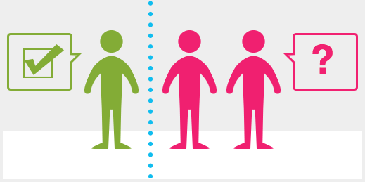
Here’s a fairly astonishing stat if your company (or job) depends on making the web usable for customers. Only about one-third of users are able to complete tasks of medium complexity online, like comparing and contrasting products. The rest bail on their online customer journey at some point to seek support from a human.
Why? In most cases, bad UX, with missing or confusing information being the most frequent culprit.
How to keep the journey from being interrupted
We’ve addressed this issue for our clients over the years, including developing interactive demos for a Fortune 100 financial services organization that decreased call center volume by 30%.
The key, as the Nielsen Norman Group study points out, is understanding each step of the customer journey, and designing for it in a way that spans all channels and anticipates issues. If you don’t, you’re most likely adding unnecessary touchpoints, decreasing satisfaction and impacting customer loyalty.


 See what they have to say