Designing your way to the presidency.
As President Trump would surely attest, there’s one thing every 2020 candidate needs – memorable branding. In pursuit of that goal, some Democratic contenders have really stepped it up this year. We’d like to highlight a few of the biggest design risk takers (even if their risks didn’t pay off with voters) and point out three big branding trends.
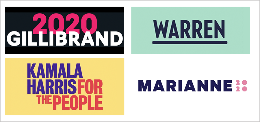
 Candidates are using a rainbow of colors.
Because America’s brand is red, white and blue, politicians have conformed to that palette forever. But the times they are a-changing. Pink, purple, green – it’s all fair game now as candidates seek to call attention to their own unique brands first. Notably, female candidates have been the boldest in showing an independent streak.
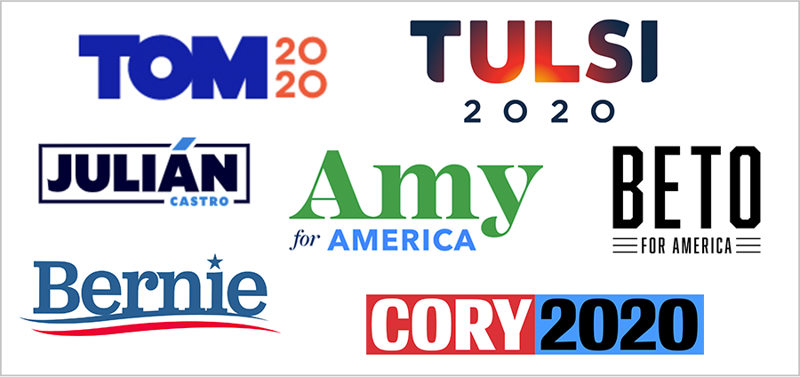
 We’re on a first-name basis now.
In a country where we evaluate candidates on whether we’d like to have a beer with them, it’s not surprising first names are a hot political branding trend. This approach makes perfect sense if your name is distinctive like Tulsi or Beto. But what if it’s Tom? (Stumped? Here’s a hint: he’s one of three billionaires running.)
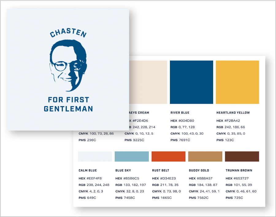
 Mayor Pete is democratizing design.
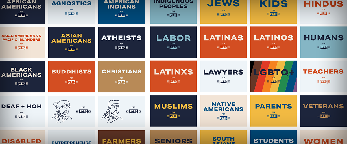
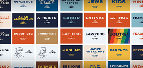
By making a design toolkit available to the public, Pete Buttigieg is getting truly creative with his branding. The kit features nine color options representing meaningful facets of his life, including two browns for his two canines. While we’re dog people, that seems like overkill even to us. Still, points for a turnkey design system for grassroots supporters of all stripes – and for that charming “first gentleman” graphic.
As important as it is, good design certainly doesn’t ensure election success. As the presidential race progresses, we’ll be eager to see who ultimately rises to the top and who gets sent back to the drawing board.

 See what they have to say