Simplicity Spotlight: eBags
You can chalk it up to cabin fever after a cooped-up winter, but eBags’ Weekender Backpack ad compelled us to do something we almost never do. Click.
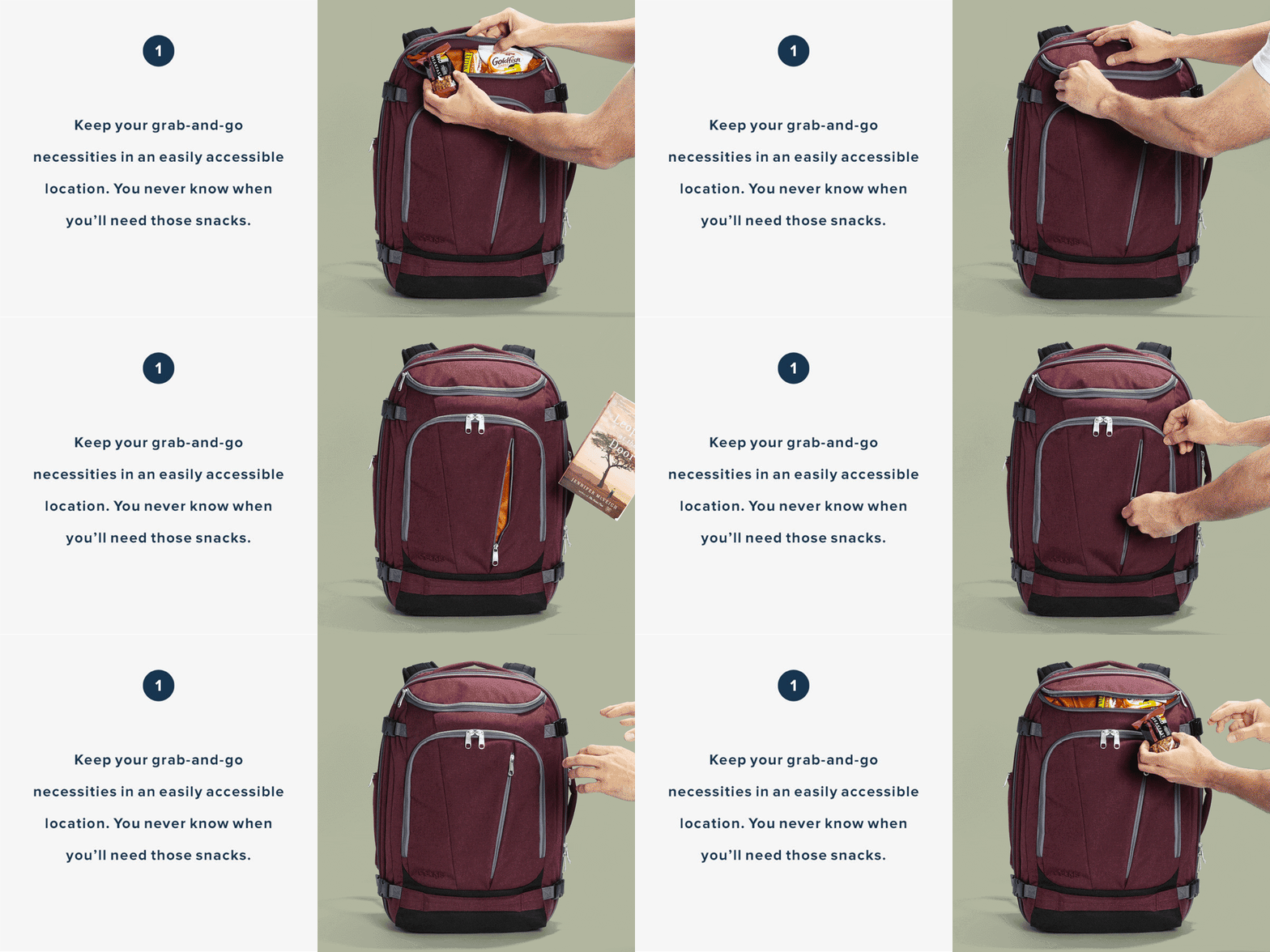
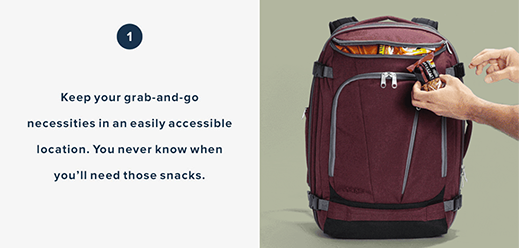
Right off, we loved the straightforward simplicity of their landing page. It’s so digestible, direct and feature/benefit-oriented that you immediately understand the advantages of their product. And the animations explain more than any amount of copy could. In fact, we wanted to start zipping and unzipping things just for the heck of it.
So kudos to eBags – a great example of a classic approach pared down to just the right amount of information. Now if we only had somewhere to take it…


 See what they have to say